Investment Chart
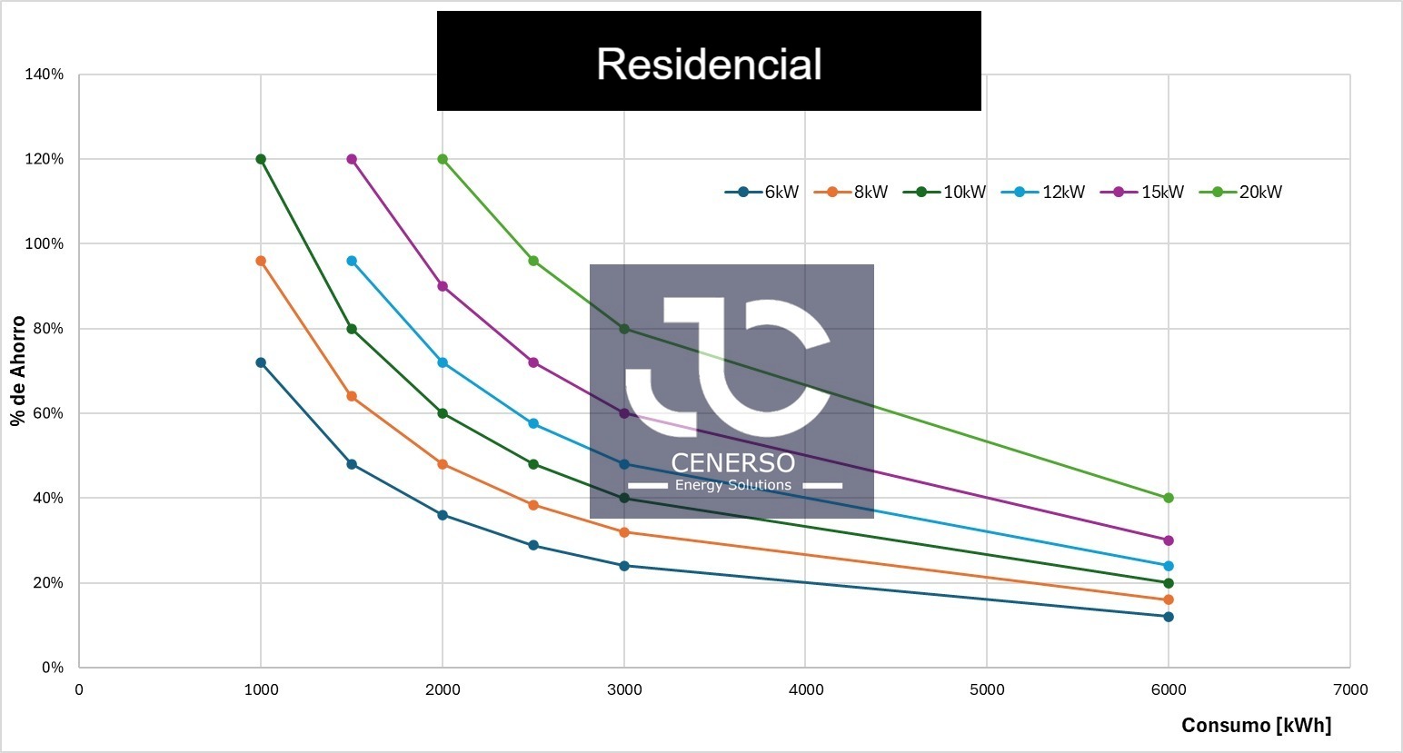
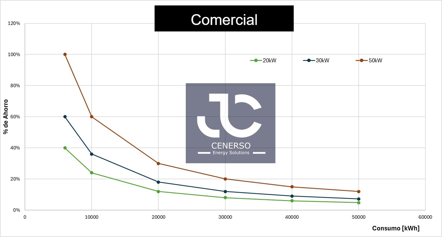
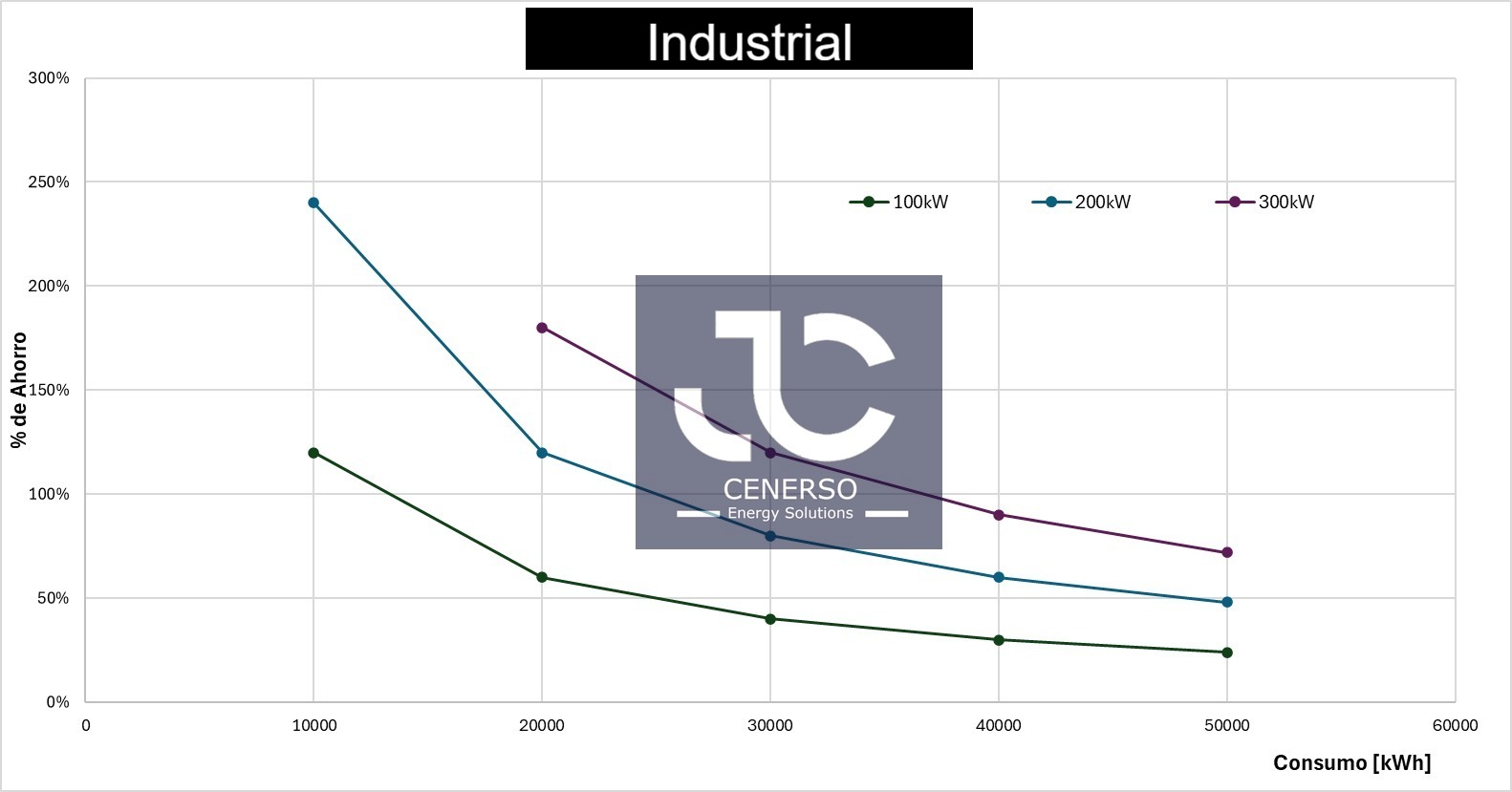
Use this charts based on your reality to estimate your savings.
These charts shows how the percentage of energy savings changes depending on the monthly electricity consumption and the capacity of an installed solar plant (in kW). Each curve represents a different solar system power (6 kW, 8 kW, 10 kW, etc.). On the horizontal axis (Consumption [kWh]), we see the monthly electricity consumption. On the vertical axis (% of Savings), is the percentage of savings that can be achieved. As consumption increases, the savings percentage decreases. This means that the higher the capacity of the solar plant and the lower the consumption, the greater the savings percentage.


